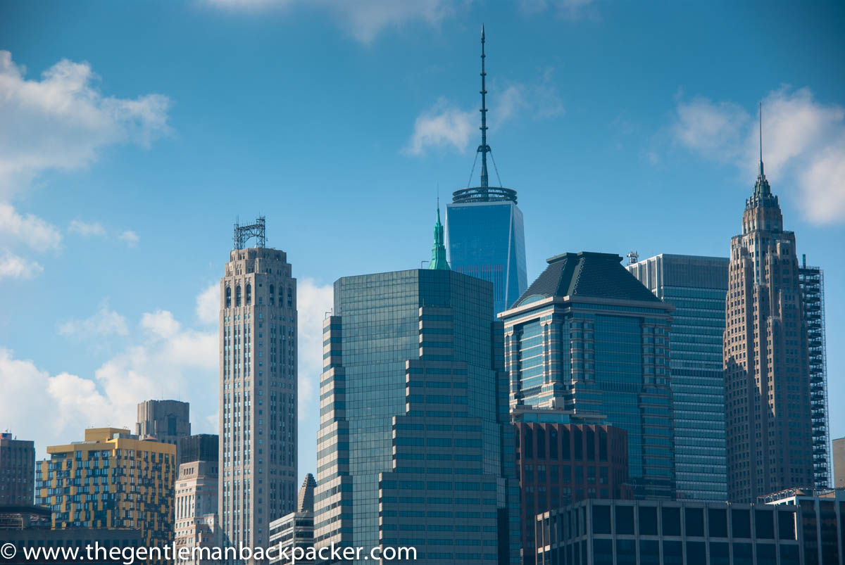
Living in New York, I benefit from having many great urban muses to shoot. The flip side is, of course, that “It’s been done before” comes up a lot. We’re all entitled to our postcard-style, “I was there,” shots. However, whether you live in New York or not, I’m sure you’ve asked yourself how you can make your photographs different from the rest. It can be a conundrum, but a fun challenge at the same time. There are many different ways you can tackle this issue: framing, angles (get down low or get up high), etc., but today I want to talk a little about using light and synecdoche.
Synecdo-what? Synecdoche is a literary device where a part of something is used to represent the whole, or vice versa. You probably came across the term in your English Literature class, but it might be hidden under some cobwebs now. I give credit to the masterful Brett L. Erickson for teaching me to use synecdoche and other literary devices (see if you can see the metonymy in his cover photo) as a composition tool while attending his photography workshop this summer in Santa Fe.
Showing just a part of an instantly recognizable subject is a great way to draw your viewers in, tell an interesting story, and allow the viewer to fill in the blanks. The second thing–and actually the most important–is to wait for the light. There are countless examples and practitioners out there you can check out, but Melinda Green Harvey, who was in Brett’s workshop with me does an amazing job of it here, and Ehpem, another photographer I have recently begun to follow does a superb take here. I know that it can be annoying to “wait for the light,” but really the best times of day to shoot will be early morning or late afternoon, especially in a place like New York City in the summer. It will make a world of difference for your photos. I’m just an amateur and it makes such a difference for me.
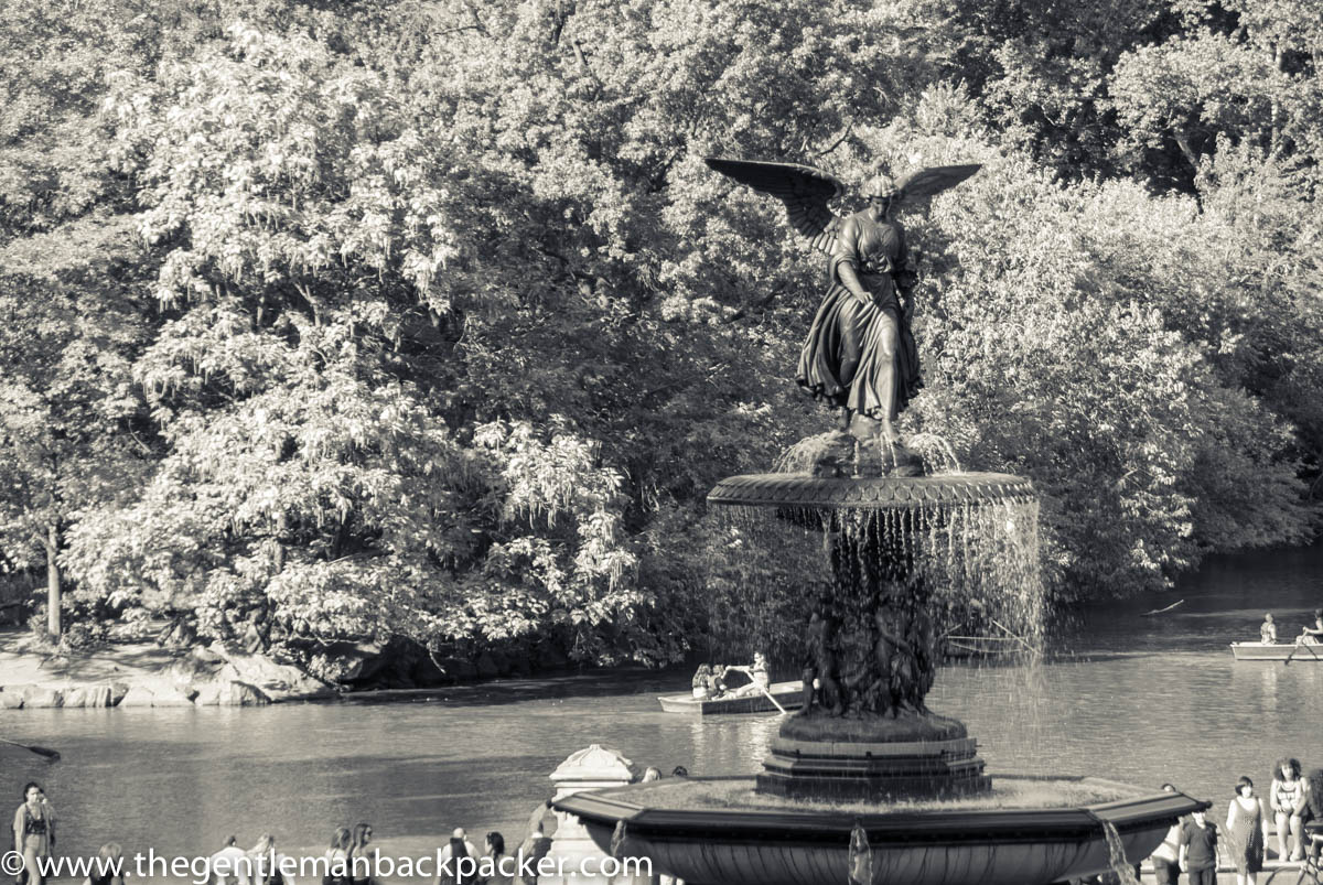
So, the photos you see here are of the Angel of the Waters Fountain at Bethesda Terrace in Central Park; most people just refer to it as Bethesda Fountain, and it is undoubtedly one of the most photographed muses in the Park.
There’s nothing wrong with this postcard shot per se, but it’s obvious and boring. It has your basic composition process in place (i.e., rule of thirds, don’t put your subject in the middle of the frame), but otherwise it has a jumbled backdrop of leaves and bushes that don’t provide contrast, and doesn’t really play with the light much. The sculptures of the cherubs at the base of the fountain are dark, and well, you’ve seen this before.
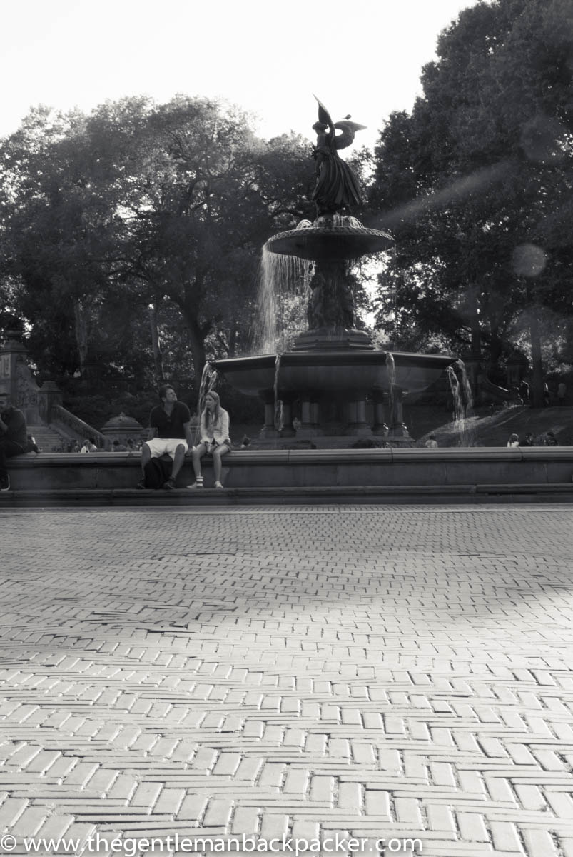
This second one still adheres to the rule of thirds, has a bit more interesting light in it, and it incorporates the texture of the bricks and their pattern. It also features a subtler “leading line” in the form of the man looking at the fountain: his gaze shifts your eyes to where he may be looking. Still, it’s pretty novice and feels a bit cliche.
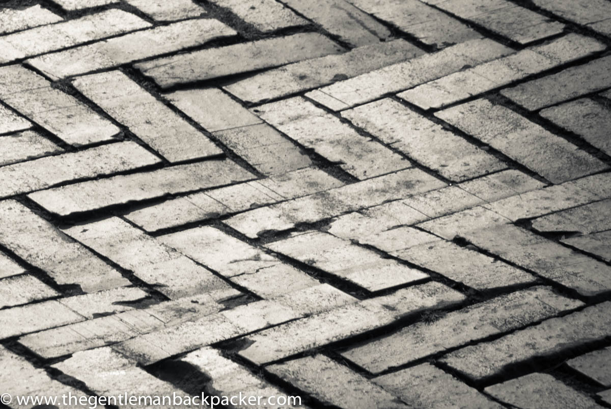
The next one below takes full advantage of the late afternoon light and features the bricks in a central role. If you’ve been there before, you will probably recognize the bricks. It’s a nice way to mix up your photos of the spot, but it may err too far in terms of subtlety. While the location may be obvious to many, to others it may just be a close-up of zig-zag bricks. It’s not as iconic, as say, the sidewalk pattern at Copacabana Beach.
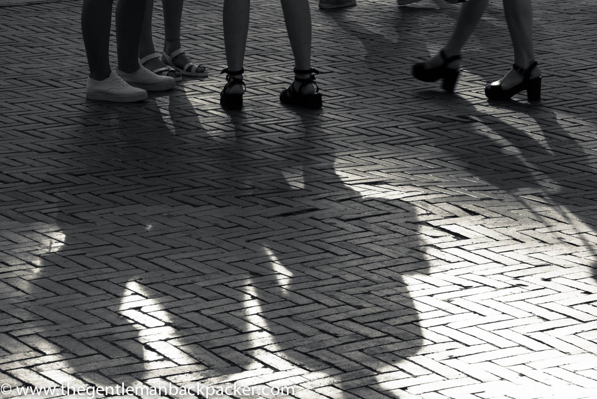
This next one should provide more information to the viewer, without going so far as to show the fountain. It’s a busy spot, and here some young women chit-chat by the fountain. The shadow of the bag held by the woman on the right is playful, and now the bricks should be more recognizable as there is more context.
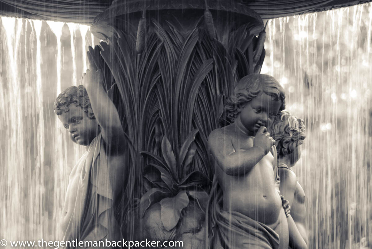
Ah, but you want to shoot the fountain itself, you say? Sure, let’s do that, but feature the “forgotten” cherubs from the first postcard, and ooh, look at that light now. It’s a backlight, making the shot a bit tricky, but still doable for an amateur like me. Google Bethesda Fountain and see how many pictures you’ll find of these guys (as opposed to the angel).
And that’s all there is to it. If I can do it, you most certainly can. If you want to read more in-depth about employing synecdoche in your photographs, this link here at 1001 Scribbles is a great place to continue.
Thanks for reading this post! If you liked it please think about subscribing by following this link Subscribe here. You will receive an email when new articles are posted. Your email address will be secure and you will never receive any marketing emails from third parties. Every new subscriber matters since this is a relatively young site. We really appreciate your support.

Thanks so much for the wonderful mention! I like the brick details a lot. And the last shot too with a curtain of water.
You’re most welcome for the mention. I very much admire your work. Thank you for stopping by.
George – thanks for the mention!
I liked this post – my writing teachers have always talked about “show-don’t-tell” and you did a great job of showing your readers the information you were conveying.
Also – I am glad you found Ehpem’s blog!
Hi Melinda,
You are most welcome. Your photo fit my theme perfectly, as did Ehpem’s so this tied in very nicely. I’m glad the “show” method seemed to work here. Thank you for the comment and hope you are well!